

UEFA EURO League monitoring app
Role
Lead Product designer
Background and goals
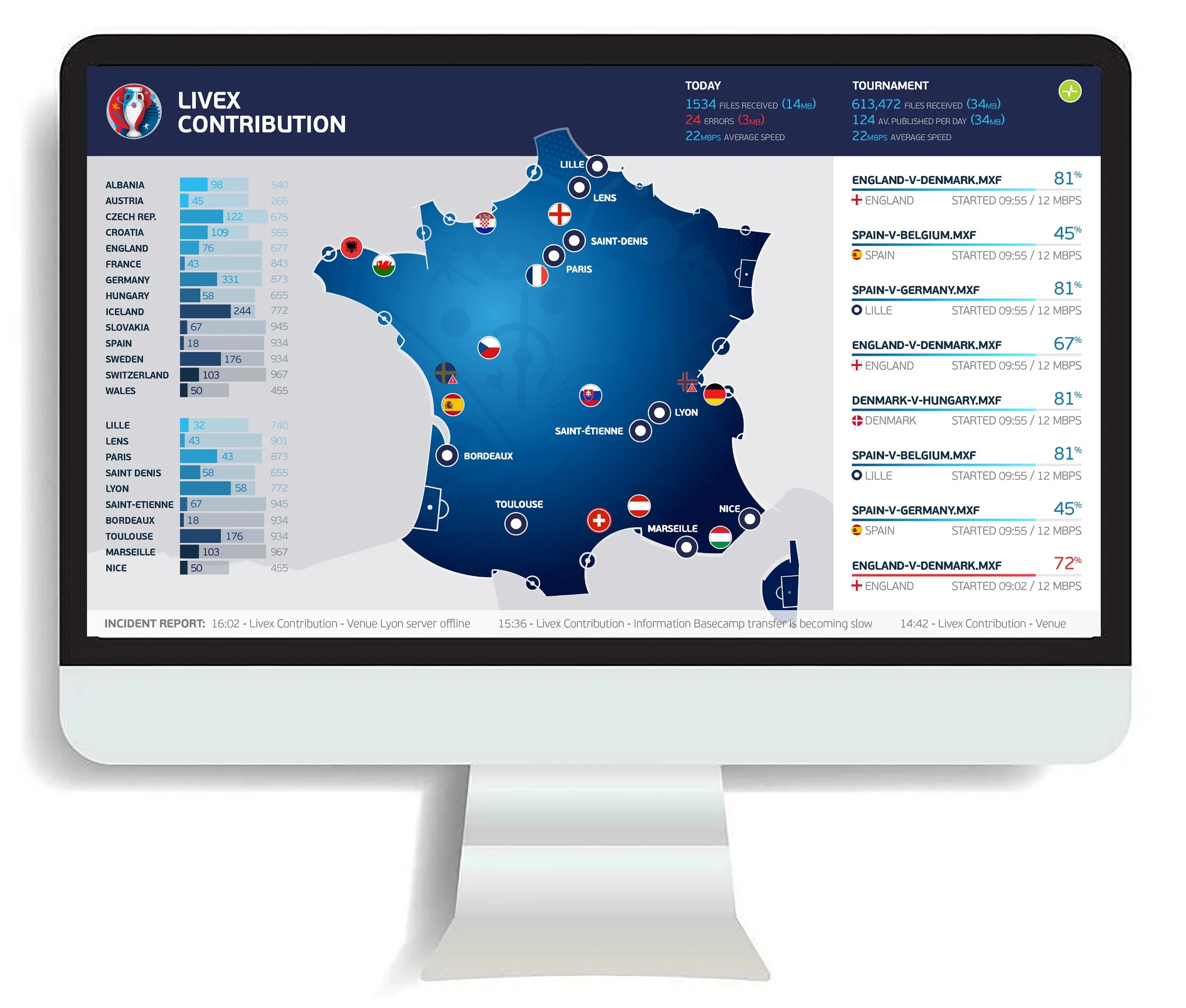
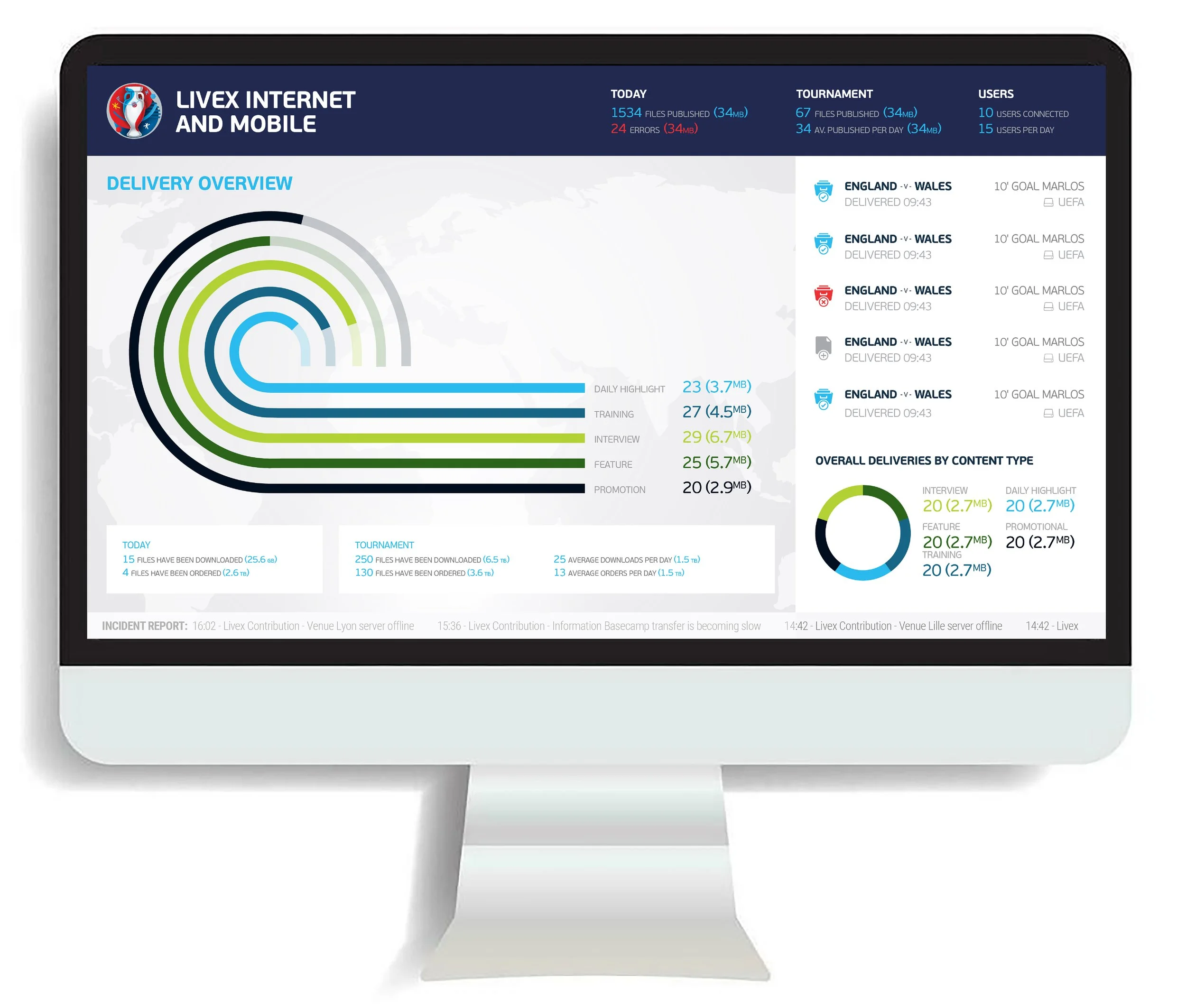
During the 2016 UEFA EURO Championships, UEFA sought to monitor its incoming and outgoing data feeds. The application was specifically designed to track the successful and unsuccessful delivery of video data feeds to broadcasters such as BBC Sport, Eurosport, and Sky. Additionally, it monitored the performance of all other UEFA data platforms as they transmitted real-time data throughout the football matches, all presented through an eye-catching design.
Key challenges
The primary challenge was to develop a single application that could provide a high-level overview of key metrics without being overwhelming, while also serving as a detailed, data-rich platform for the analytics team. Additionally, since the monitoring application was also used as a branding tool for UEFA, leadership expected the visualizations to be unique and memorable, reflecting UEFA's brand identity.
Impact and achievements
We not only met but exceeded both business goals and user needs.
The UEFA League Monitoring app, launched for the EUROs, received stellar feedback from both stakeholders and broadcasters.
Following the app's success, we established a strong, long-lasting relationship with UEFA, which has led to new projects.
Identifying business constraints and dependencies
A significant business constraint was the budget for only a single application to support two distinct user groups.
To address this challenge, I facilitated brainstorming sessions at UEFA's Geneva office to identify overlapping user needs. After outlining key user requirements and finding a common entry point on the overview page, I was able to develop creative interactive patterns. These patterns supported both a presentation-style view of the data and provided a pathway to a more complex, interactive view, effectively catering to both user groups within a single application.
The issue resolution process involved complex dependencies, as the analytics team frequently needed to pass information to other internal teams or gain leadership approval. To support this workflow, I introduced an export function within the application, allowing for the easy sharing of crucial data and facilitating a more efficient approval process.
Designing for user intent
I conducted user interviews to gain a deeper understanding of user expectations and workflows. This process revealed two primary user groups:
'High-Level Spectators': This group, which included C-level executives and VIP guests from TV and radio channels, wanted to see engaging, presentation-style visuals with only key data points. These visualizations also served as a branding opportunity for UEFA, so they had to creatively reflect the organization's identity.
'Business Analyst Team': This group, consisting of UEFA's internal data processing and IT team, required the ability to interact with the data, drill down, and expand it as needed to resolve issues.

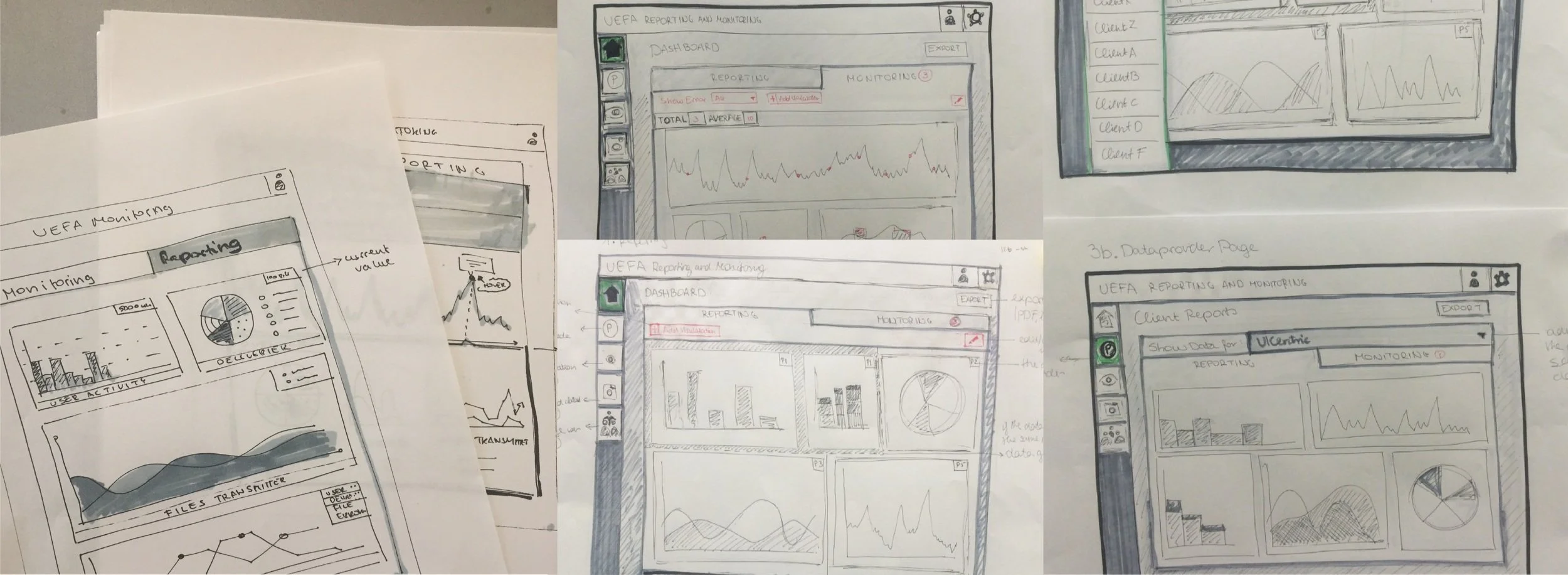
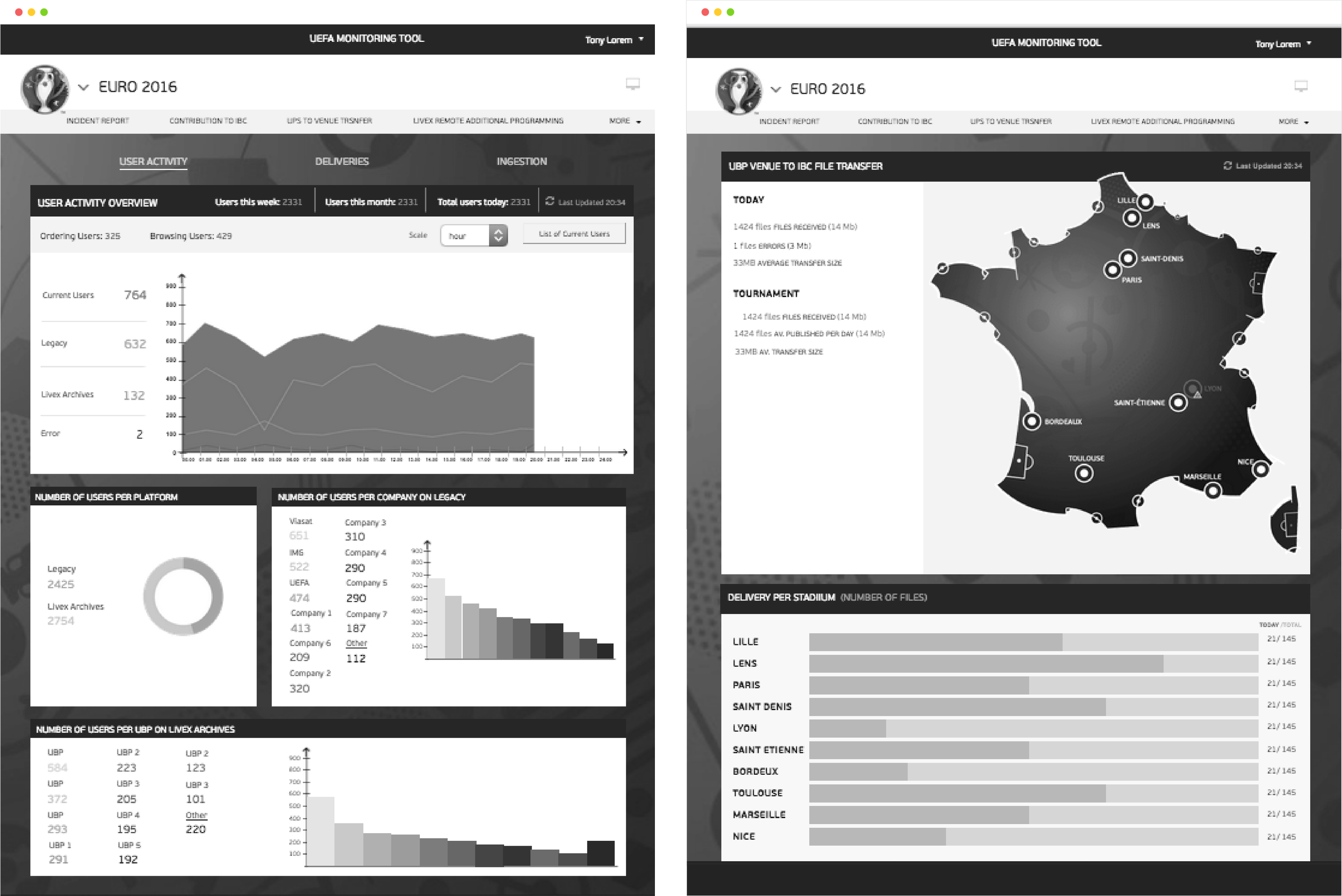
Mapping out the flow and right product structure
To support the storyboard with the product structure, I developed an architecture model that accommodates both user groups.
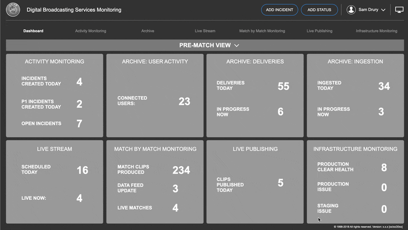
In presentation mode, the architecture allows 'high-level spectators' to view key overview information. Meanwhile, the analytics team can use the same application in desktop mode to interact with data sets, click into data points for expansion, and scroll to view secondary data.
Mapping out the complete application provided a clear understanding of the project's scope and the user flow across different pages.

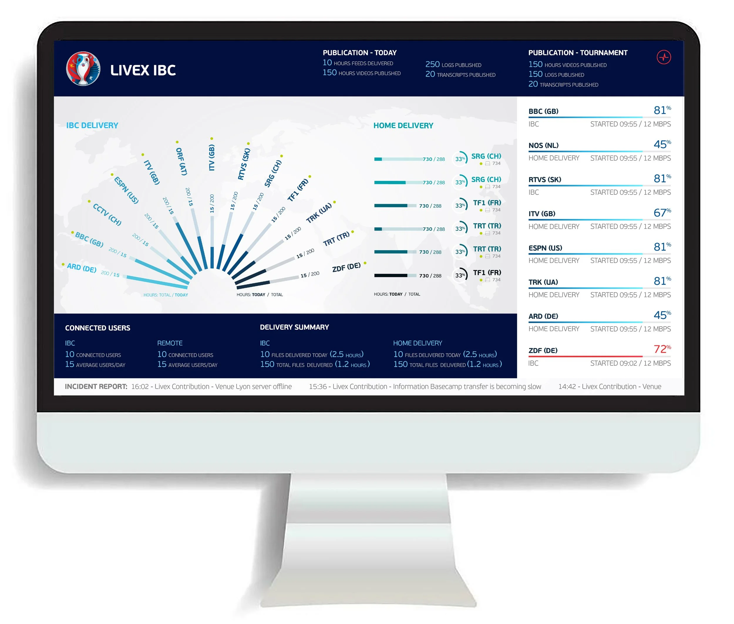
Exploring ways to tell the story with data visulazation
While the application had to be both functional and engaging, it also presented an opportunity to create unique, on-brand visualizations for UEFA. I defined interaction patterns that allowed for expanding visualizations, which enabled us to create dynamic and playful information displays. After extensive sketching, I landed on a direction that received full stakeholder agreement.
Usability testing
Creating and testing a wireframe prototype early allowed me to gather feedback and ensure that the product architecture, data hierarchy, and interaction patterns were all correctly aligned with user expectations for exploring the information.
By aligning early with both business and user expectations, I was able to ensure that the product was developed on the right path.

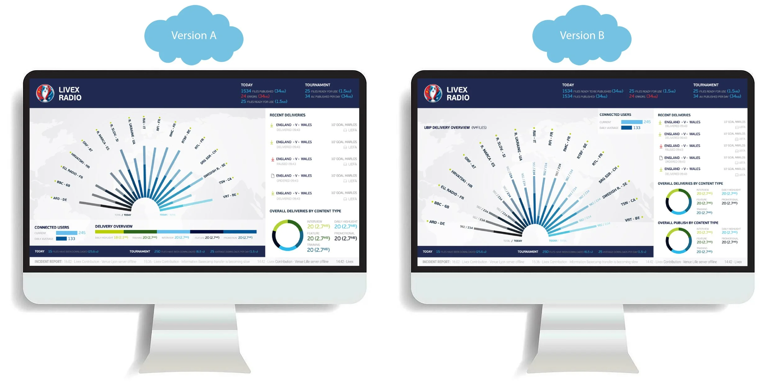
Validating the layouts data presentation and focal points
To test the designs, I conducted an A/B test. One design presented the delivery overview in a bar chart with connected users displayed alongside it, while the alternative design integrated both the delivery overview and connected users into the same card.
While both layouts were well-received, the majority of users preferred the second version. This was because it allowed them to focus on the main data set, with other information appearing as complementary data in a side panel. Based on this feedback, the connected users element was moved to a separate bar chart below the primary visualization in a later iteration.
Final designs