
Background and goals
Paramount identified a critical need to overhaul its "Demand 5" television app, which suffered from technical limitations and a dated interface despite its popular content library. The primary objective was to create a modern, best-in-class application focused on four key principles: a visually compelling design, intuitive usability, full accessibility compliance, and a seamless, consistent user experience across all platforms, including TV, desktop, and mobile devices.
Key challenges
The primary challenge was two-fold: we needed to develop a unified design system and interaction patterns that could be seamlessly adapted across multiple platforms, and we also had to deliver a streaming experience that was visually appealing, highly engaging, and intuitive while meeting the diverse needs of various user personas.
Channel 5 design system and interaction patterns
Google Ads & Google Merchant Center Design System
Role
Design system owner
Background and goals
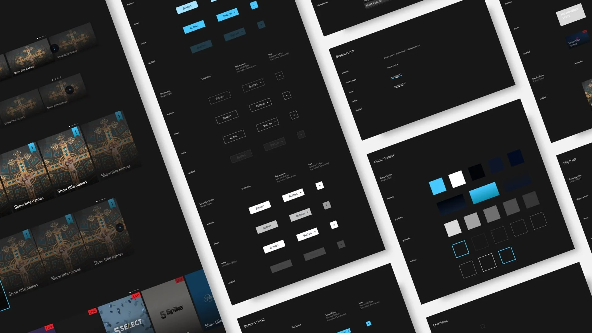
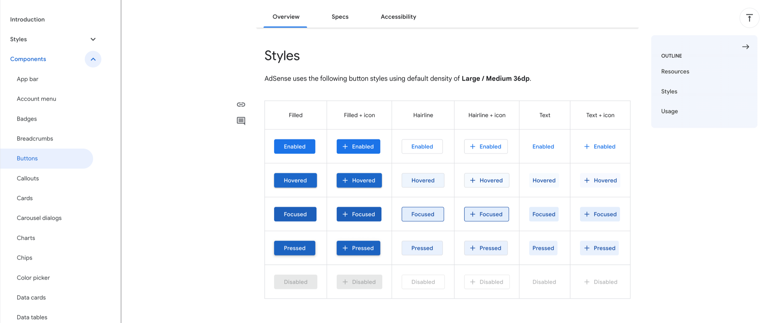
As the owner of the Google Ads and Google Merchant Center design systems, I was responsible for maintaining design integrity and consistency across all products. My primary role was to govern the component library, ensuring designers exclusively utilized established components.
When new components were required, I oversaw the entire creation process: defining usage guidelines, creating detailed technical and accessibility specifications (redlines and greenlines), and all interaction patterns and states as well as animations. I have regularly reviewed designs and implementations to ensure that the components were used correctly and it was also aligned with the parent Google Materials library.
I have also created the Figma components in a central repository, which were linked to comprehensive usage documentation on a dedicated Google site.
Achievements and impact
Created interactive elements
Created a new component library on Figma
Set up a central repository where all: usage, red lines, interaction patterns and accessibility specs are documented for each component
Aligned the design teams use cases as well as do’s and dont’s
Led and ran the design team alignment session
Led the design review sessions and captured requirements for new components
Designed and defined new components for Google
Co-authored of the Google Material playbook which is widely used at the company now


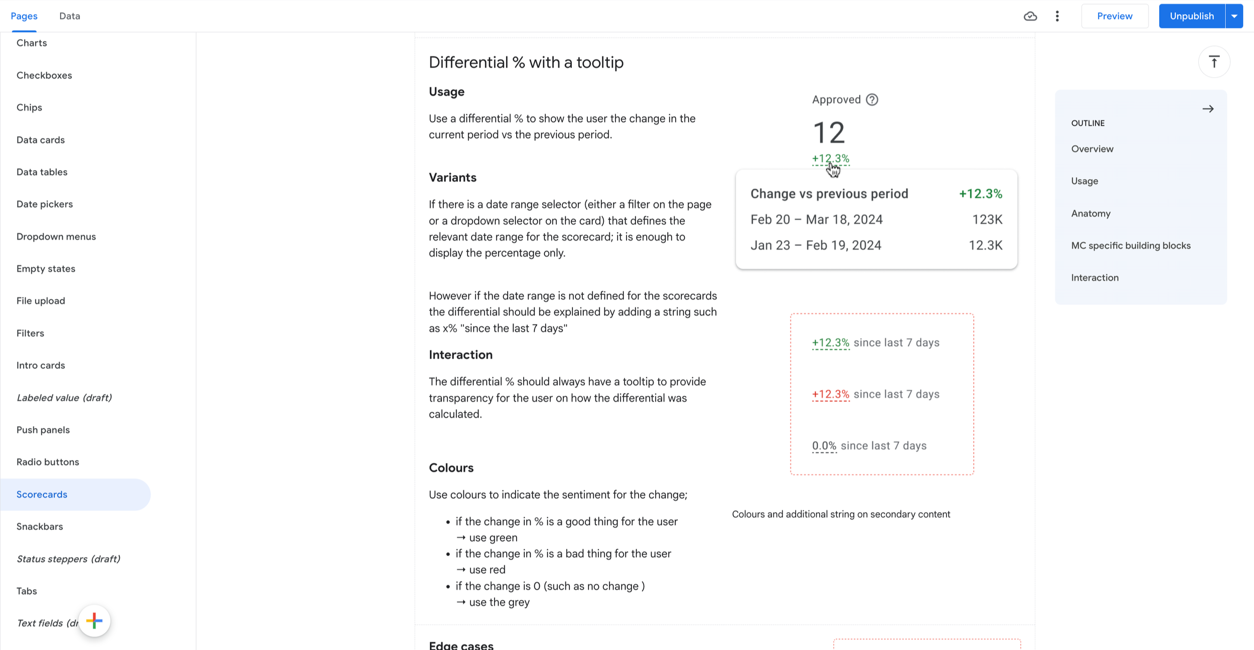
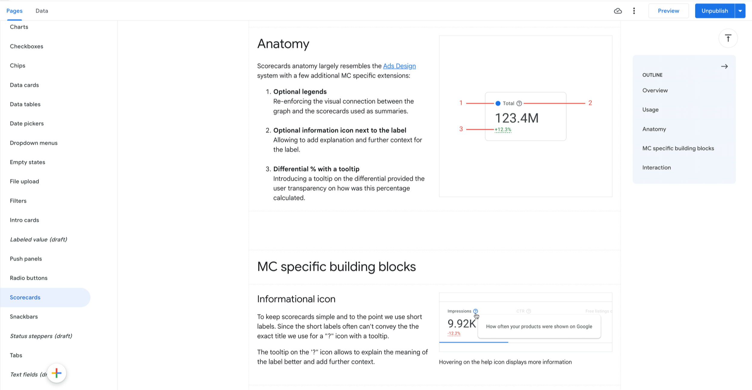
Designing for complexity
I often encountered the need for more complex components, such as the anomaly card for the AdSense product homepage. This feature allowed publishers to immediately identify potential issues or opportunities with their monetization strategy. To present information efficiently, I used animation to hide secondary details, providing users with only the essential information at a glance.
To ensure our components were correctly designed and laid out, I regularly ran user testing sessions. The feedback from these sessions not only informed our component design but also guided the further development of the entire design system.

