

Paramount - Channel 5 TV app
Role
Principal product designer
Background and goals
Paramount identified a critical need to overhaul its "Demand 5" television app, which suffered from technical limitations and a dated interface despite its popular content library. The primary objective was to create a modern, best-in-class application focused on four key principles: a visually compelling design, intuitive usability, full accessibility compliance, and a seamless, consistent user experience across all platforms, including TV, desktop, and mobile devices.
Key challenges
The primary challenge was two-fold: we needed to develop a unified design system and interaction patterns that could be seamlessly adapted across multiple platforms, and we also had to deliver a streaming experience that was visually appealing, highly engaging, and intuitive while meeting the diverse needs of various user personas.
Impact and achievements
The new channel 5 app was shortlisted at yearly UK UX awards 2018
The app store rating was increased from 1.4 to 4.5 stars
Reviewing the existing experience: Heuristic evaluation
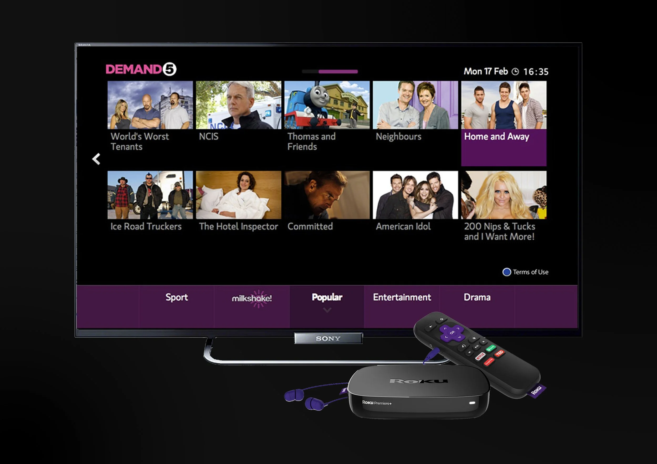
To better understand the elucidating factors on why the current "Demand 5" application is under performing , I have carried out a heuristic evaluation. Out of the complete evaluation the most significant issues were found were the following:
Flexibility and Efficiency of Use
The application exhibited significant navigational challenges, resulting in a suboptimal user experience. Specifically, the Roku application's navigation bar, positioned at the bottom of the screen, necessitated extensive horizontal scrolling, impeding efficient user interaction.Recognition Rather than Recall
The lack of clear content organization and layout resulted in a poor information hierarchy and additional effort to find content. Inconsistent use of UI elements made it difficult to recognize interaction patterns and predict input and output, increasing cognitive load.Aesthetic and Minimalist Design
The application's static and monotone visual design lacked engagement. The uniform treatment of UI elements, the absence of transitions and animations, and the uninspiring presentation of show tile imagery contributed to a monotonous and unengaging user experience.
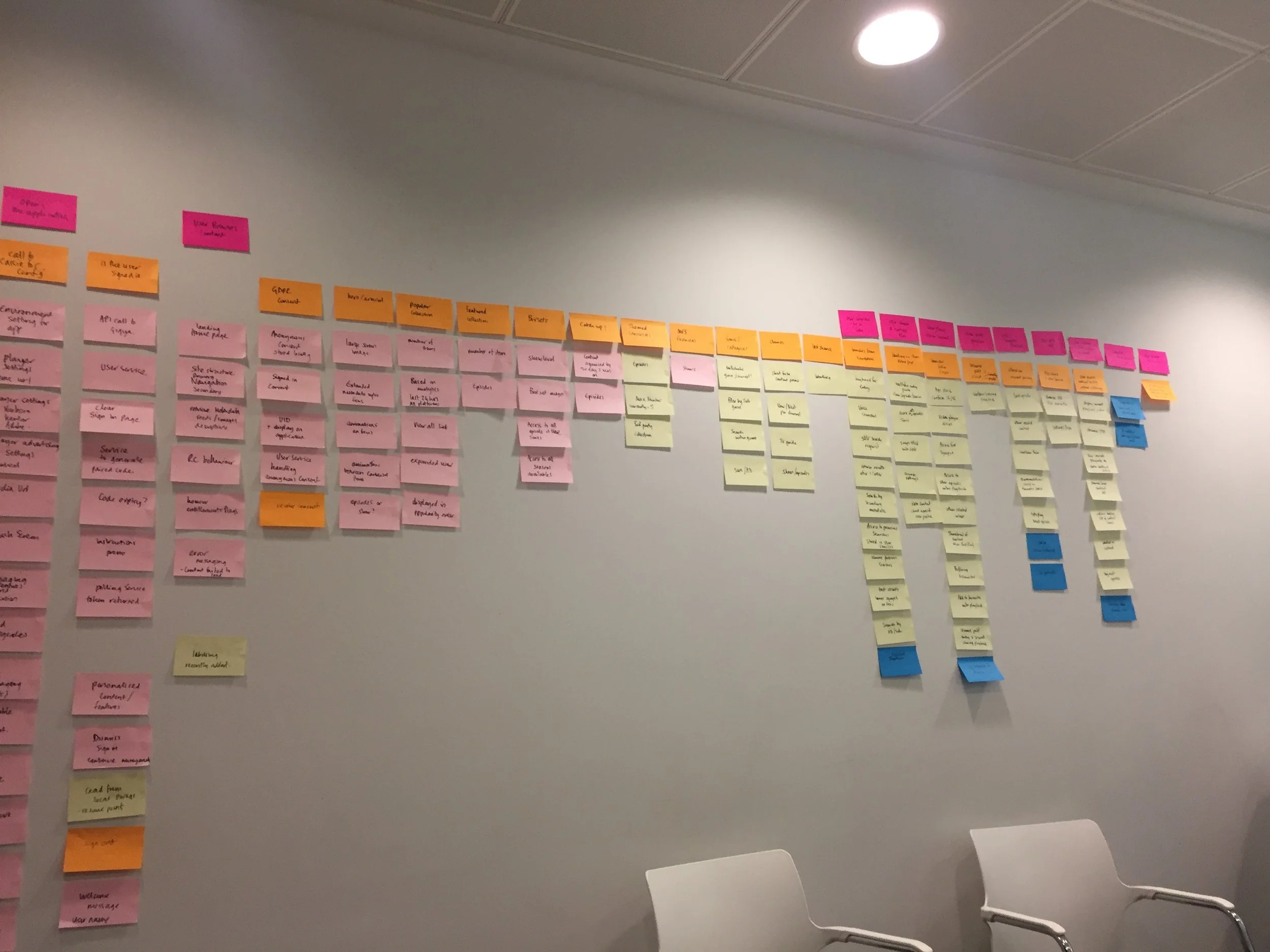
Mapping out the new product experience: Discovery workshop
I have led a multi-day workshop with all key stakeholders involved, allowing us to discuss previous findings, prioritize those and prepare to re-create the My5 experience. I led a storyboarding session to define an ideal critical user journey, meeting the primary user needs. Then, we started to draw up the user tasks under each journey and to establish dependencies between them. Once we had the key touch points defined by the user tasks, we started to map out the architecture.
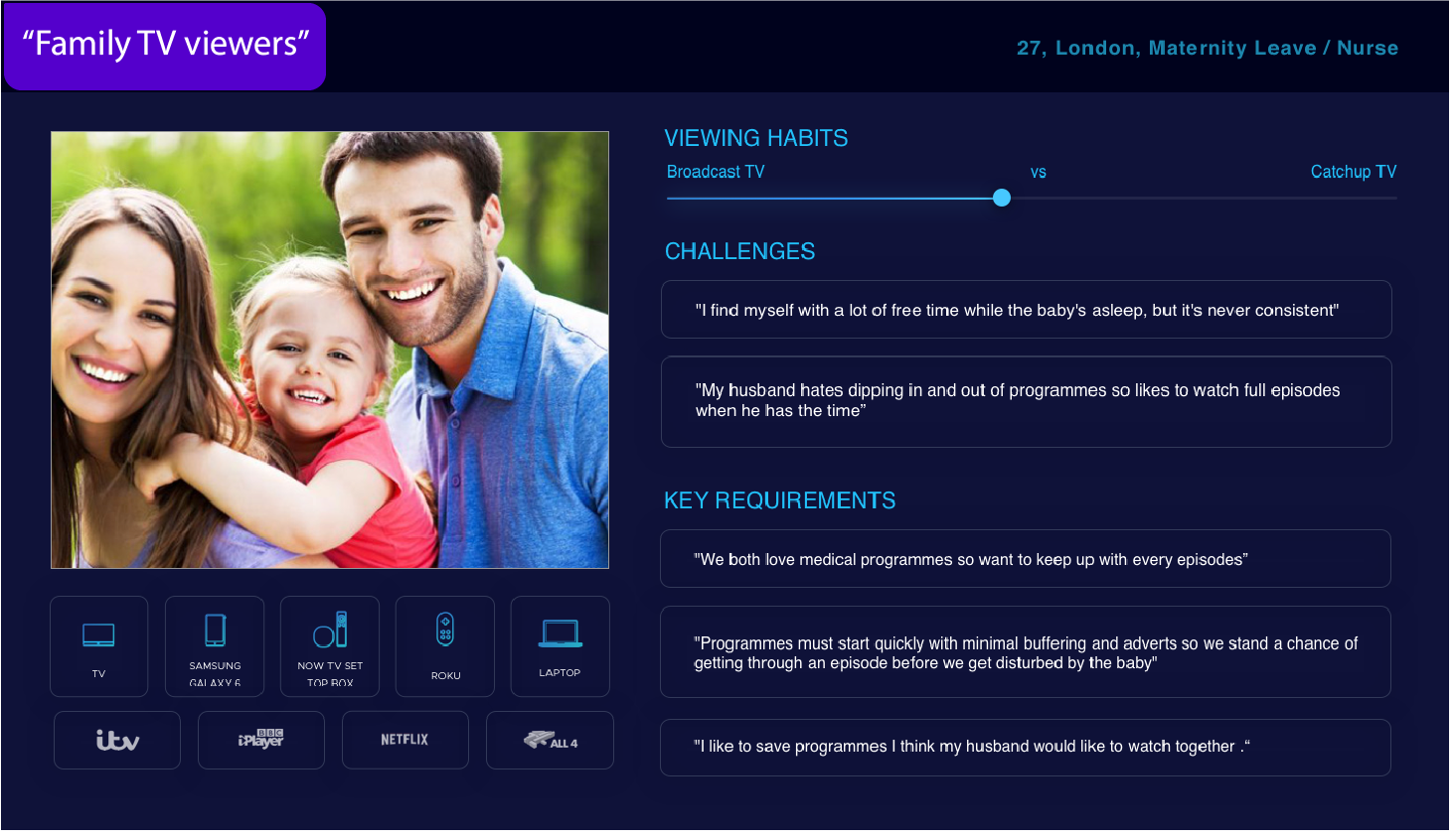
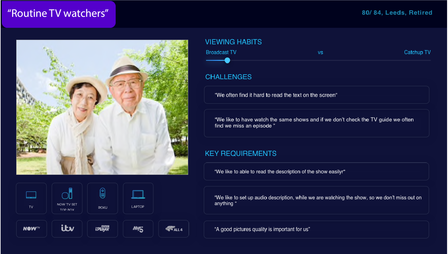
Understanding the existing user base
I used the data from the quantitative user research to identify user behavior patterns which mapped into 3 main persona groups based on the way they consume content. To understand the “why“ behind their feedback and better understand each persona group's needs I have interviewed 3 users from each persona group in person. This exercise led me to understand the “why” behind their answers.

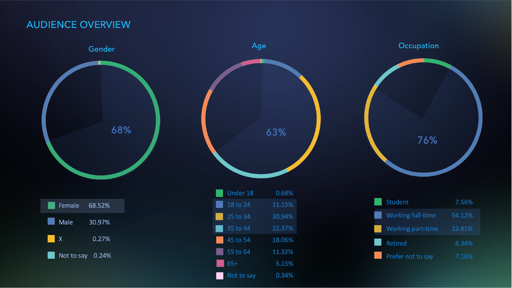
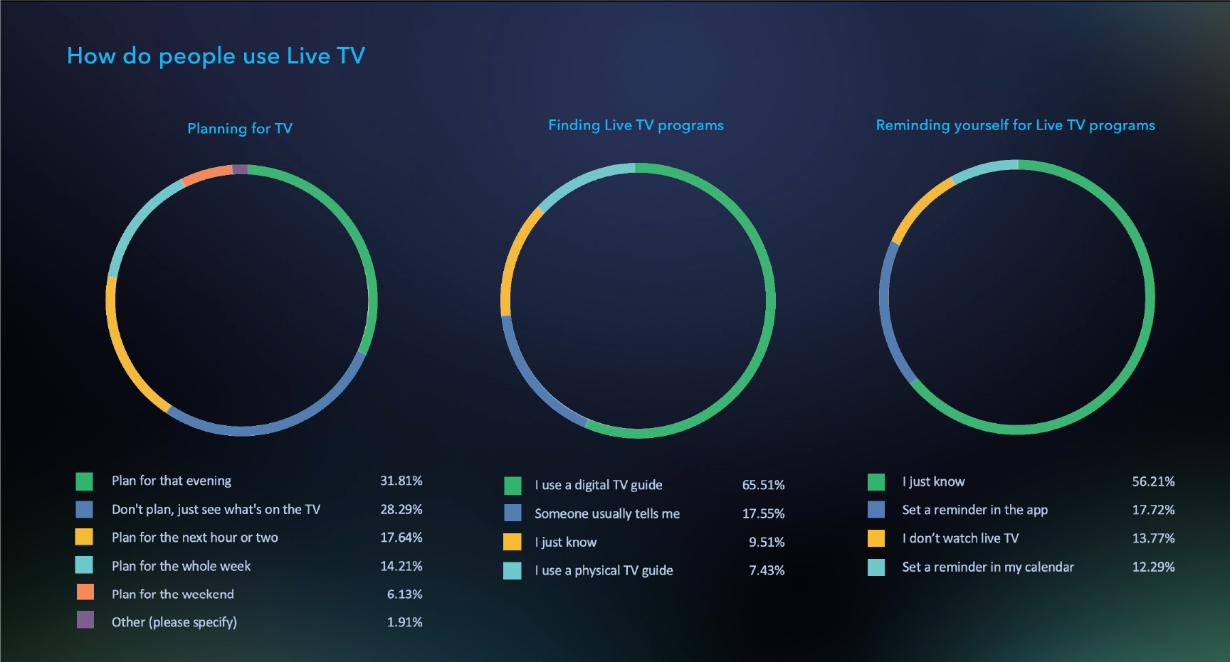
I sent out a multi-choice questionnaire to over 10,000 users. All the questions were carefully drafted along a narrative so the user can better visualize the scenarios and provide their personal thoughts and in the last section their recommendations for new features. Once the users have completed the questionnaire; all the results were aggregated and presented back to the business.


Understanding the existing market: Competitor analysis
Having now better understood the needs of the current channel 5 viewers, I reviewed the apps that they most frequently used to watch TV. My aim was to see what each of these providers do well and what things they could improve on. This document helped to give Channel 5 a competitive advantage in the areas that haven't been well executed by their alternatives.

During the user testing session we have learned the following:
Users liked the featured list with the large hero images - they also really appreciated the length of the show displayed
Displaying previously searched results was very well received
Users enjoined that they can use the app without having an account or being logged in - however they were promoted to create/ use their account when they wished to add shows to favourites
The browsing experience needed to be refined as users preferred the currented content such as ‘Popular’ ‘Recently added‘ separated from the other genres
Users were keen on switching between the different Paramount channels as they often used this platform more like they would live TV - therefore we have updated the UI and integrated a channel selector into the main menu.
When the user was navigating across channels technically it was not possible to store the last point of view item - which has created confusions during the user testing on why it is the case - so to make sure that is clear that when the user is switching to another channel they are leaving the My5 app a confirmation screen was shows
After aggregating all the feedback , grouping it then prioritizing that, I have gone on to update the flow to reflect the feedback.
Validating the new product approach: Testing the inital flows
Once the architecture was created I started creating low-fidelity wireframes to test our assumptions early and make changes as needed. I have created an interactive prototype that was shared during the user testing session. The testing lab was using eye-tracker to pick up on subconscious user behaviours.
Creating a scalable experience
Interaction and input A significant challenge in this project was achieving a consistent user experience across diverse TV devices, many of which featured different types of remote control designs. Notably, the Freeview platform required compatibility with both remote and mouse-only input. To address these input variations, we implemented an input based interface. Such as when a mouse input was detected, on-screen navigation arrows and the main menu were displayed. This design decision facilitated the discovery of concealed content within sliders and provided clear access to the primary navigation users to discover hidden content on the sliders as well as to access the main navigation.
Long titles and descriptions: To accommodate potentially lengthy titles and descriptions, we introduced interaction patterns enabling users to reveal the complete text when necessary. This approach ensures information is available without overwhelming the initial display.
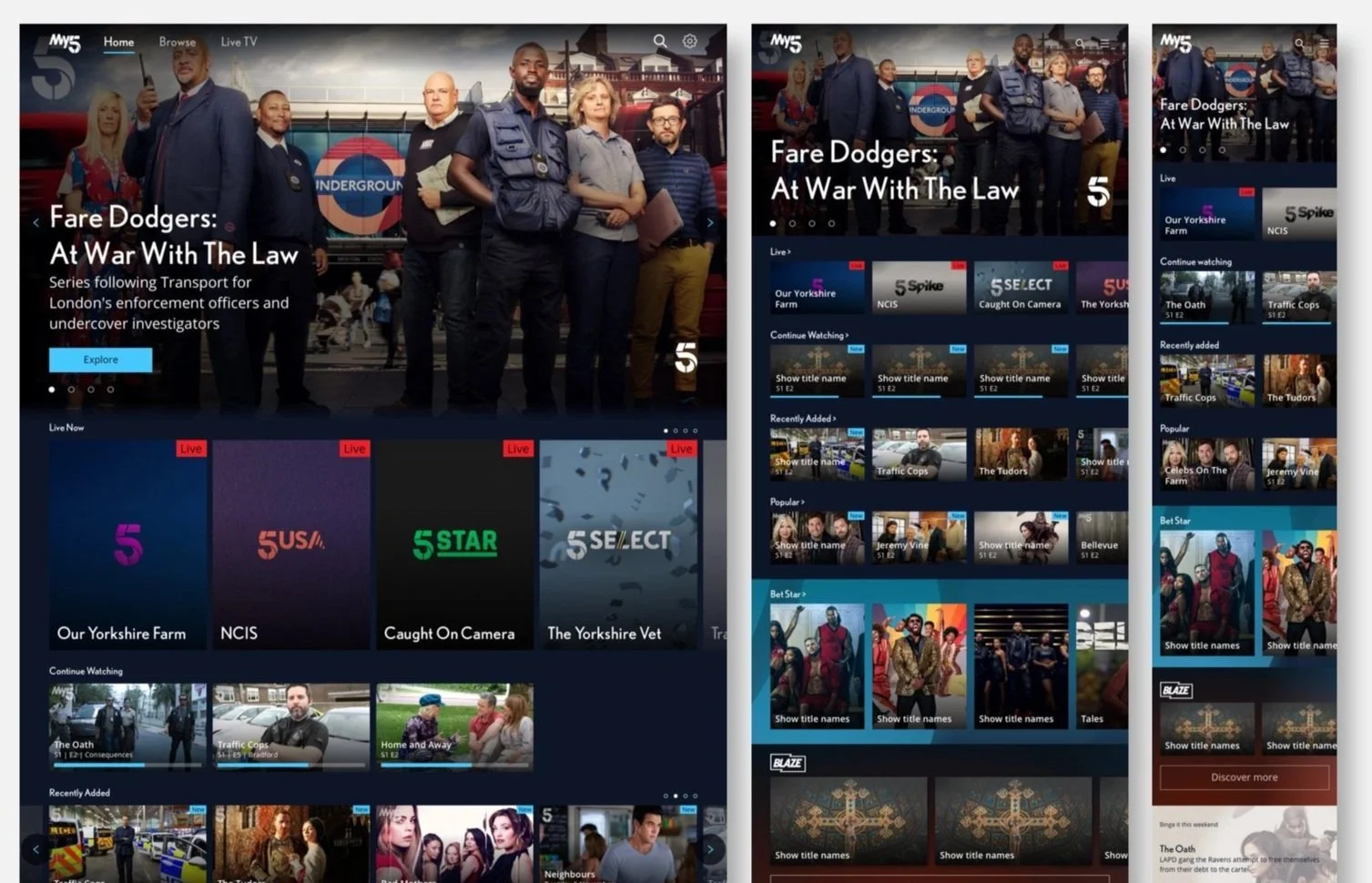
Designing for different screen sizes: While the primary viewing context for My5 was large television screens, a substantial user base also accessed content on tablets and mobile phones. Maintaining a consistent and seamless navigation experience across these varying screen sizes presented design challenges. Our approach focused on responsive design principles to adapt the layout and interactions appropriately for each platform.
Accessibility: Addressing accessibility requirements was paramount, with a focus on users with visual, auditory, or motor impairments. To support users with visual impairments and motor skill limitations, we designed a parallel comprehensive user experience navigable solely through voice-over commands if needed. For users with hearing difficulties, we integrated subtitle functionality accessible via both the settings menu and during playback.
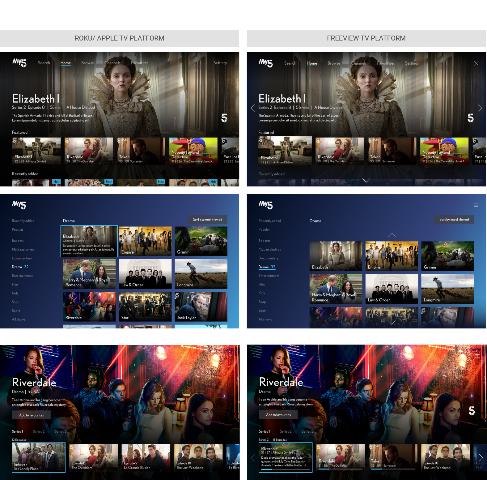
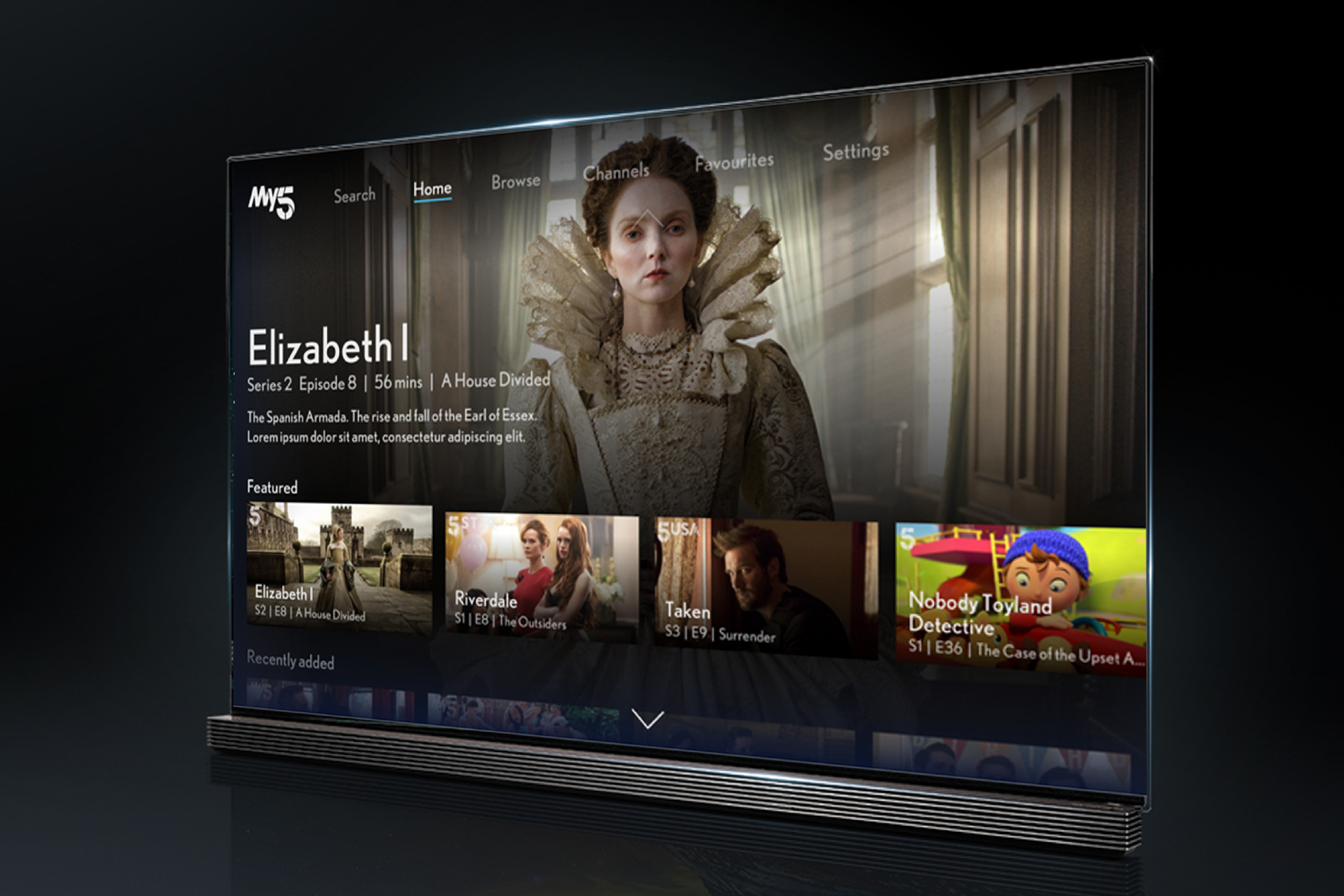
Validating the new product approach: Interaction patterns and visual design for various TV platforms
Following the definition of the user flow, the team and I commenced the visual design phase for the My5 product. Upon establishing the design language and design system, we applied these to the existing wireframes, enabling the creation of the final application visuals. To evaluate both the visual language and interaction patterns, I developed a prototype for user testing and feedback collection. The screen designs were positively received, and minor adjustments, such as the inclusion of pagination indicators and a progress indicator for watched movies, were subsequently integrated based on the feedback.
The final experience