Bupa claim management app
ROLE
Senior Product designer
BACKGROUND AND GOALS
As a prospective client for our agency, Bupa wanted to see how their current claim management overview app facilitates the discovery of unresolved claims.
CHALLENGE
Translating complex information structures and nested data sets into a clean, visually engaging UI to allow for at-a-glance viewing of both global and regional claims issues.
IMPACT AND ACHIEVEMENTS
Based on our successful pitch, our agency was contracted to continue the design and development of Bupa's new monitoring application.
Defining the problem and the user needs
Recognizing a need for a more intuitive claims management system, our agency was brought in to provide an alternative to Bupa’s in-house interface. We built upon their established user journeys and addressed the primary challenge of helping officers efficiently pinpoint claim origins and manual resolution areas.
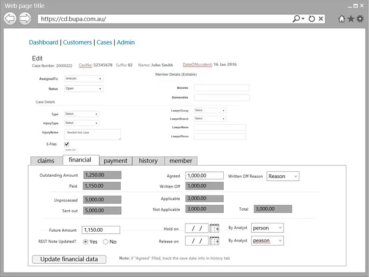
Bupa's initial interface was overly complex, with dense tables and forms that led to slow workflows and missed critical claims. To create a more streamlined experience, I redesigned the application with a new high-level entry point that provides an instant, at-a-glance overview of claim status. This approach allows users, including high-level stakeholders, to quickly identify problem areas and then drill down into the details, ensuring that no critical issues are overlooked.
Bupa’s initial interface
Proposing a possible product direction
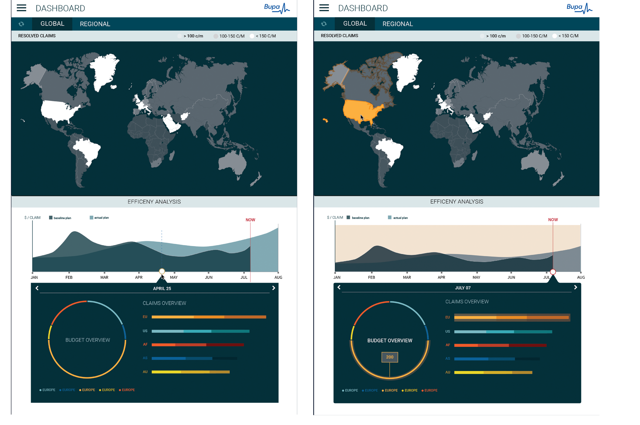
By taking a more visual approach, I transformed dense data tables into an engaging interface that helps users quickly identify key focus areas. Simplifying the entry points and creating an interactive drill-down experience allows users to get a high-level overview and then efficiently expand only the data sets they need to make decisions.
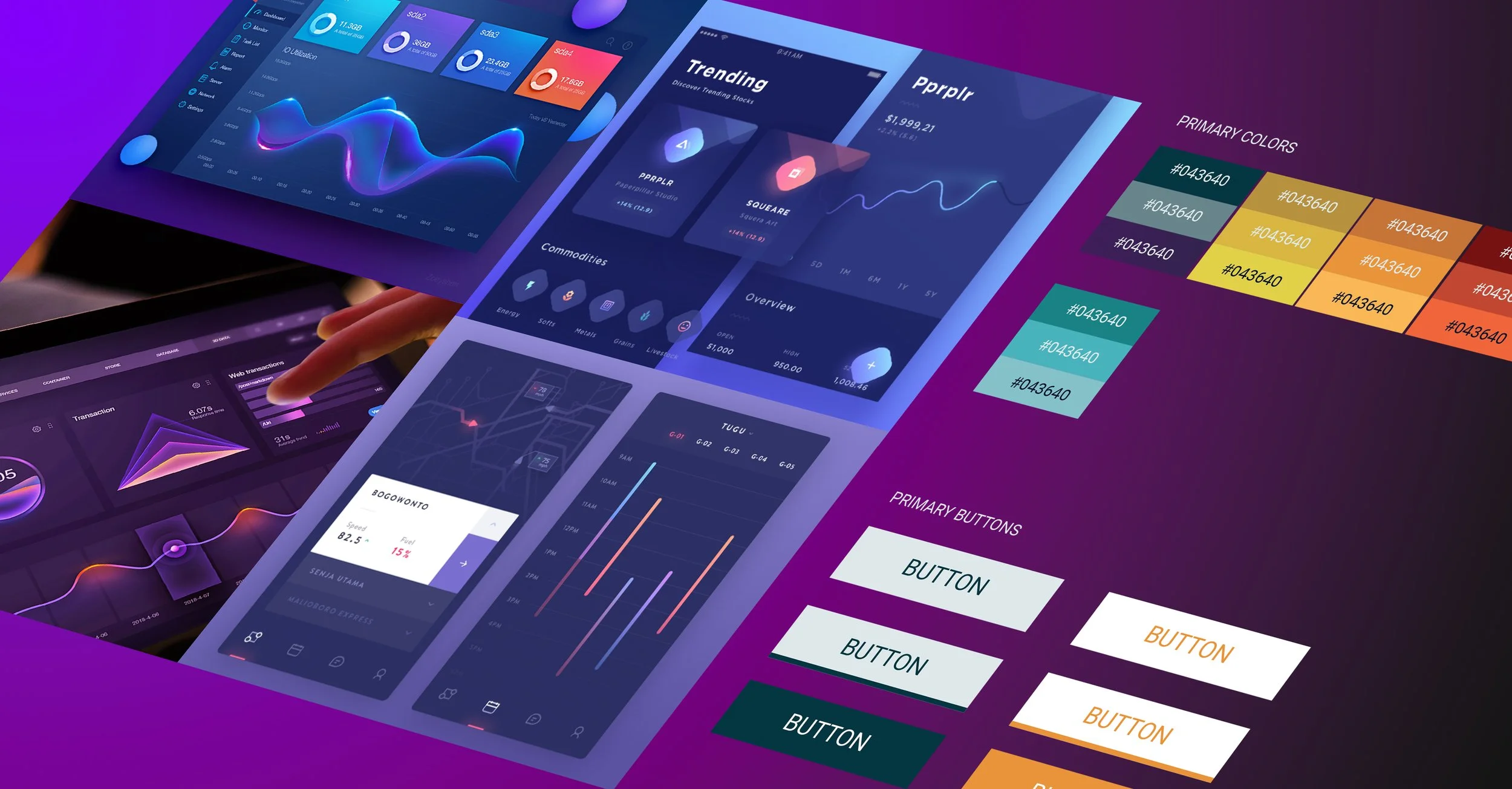
Creating a more engaging experience: Defining possible visual directions
To ensure BUPA's leadership focused on the design direction rather than the wireframe aesthetic, I applied a visual treatment to the initial mockups and developed an interactive prototype for the client presentation.
The visuals were designed to establish a professional feel while also delivering a compelling and engaging user experience. I further refined the visuals to align with BUPA's branding at the time, which predominantly featured flat colors and avoided gradients, to ensure the proposal resonated with their preferences.
Validating the new product direction: Pitch and feedback
An interactive presentation was developed to share with the client and gather feedback. The proposal for the overview page was very well-received, with particular commendation for the global overview and the clear, well-organized data presentation.


